RTE data portal
- 6 Jan 2021
- Data portal
RTE (Réseau de Transport Électrique/Electricity Transmissions Network) is responsible for operating and maintaining the electricity supply in France. The largest supplier in Europe, it decided to undertake the development of a range of its internal services on the Data topic. The client asked Pocket Prod to intervene on UX aspects of the ‘Data Compass’ project.
The Innovation and Data Department wished to contribute to this initiative through user-centered approaches, capable of maximizing the service value for employees.
By selecting specific UX design methods, including user research, we sought to align the portal’s service proposition with the user expectations.
Research
As a UX designer, my role on this mission was to conduct 21 interviews to obtain insights as to how & where people look for data, how they use it and for what purpose. Each in depth interview lasted an hour.
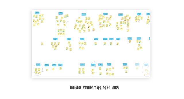
My colleague, designer Guy Pascal, took notes on a tool called MIRO, which turned out to be particularly effective since we could play with the Post-its, amend them, shuffle them, and especially work visually by creating affinity diagrams from the insights we gathered.
Design
From the data we collected, we then created 2 deliverables that we presented to the client:
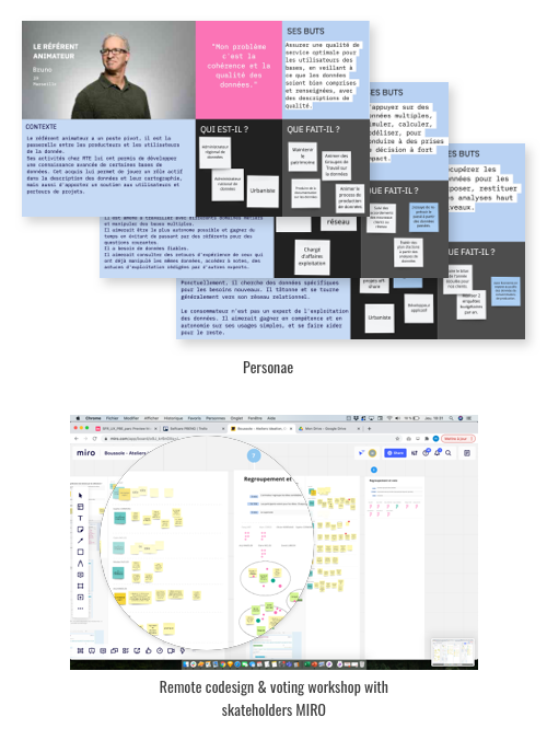
. The definition of 3 personas that would help align the RTE teams (we worked with people from different backgrounds, each with their own desired interpretation of the portal’s interface).
. The restitution of a document including insights, pain points and opportunities that were prioritized.
Based on this work we conducted six workshops during which we itemized features, pinpointing ones which would go into the Minimum Viable Product and ones which could be postponed. I then designed an interactive prototype using Invision so that everyone could have access to a common ground for sharing concerns and ideas.
My main challenges on this mission were not conducting such in-depth, detailed interviews or clearly identifying the interface needs, as could have been the case, but to my surprise it was :
. prioritizing and analysing each insight from a such a relatively large volume of data and
. aligning stakeholders on a shared prototype.
Once my UX work was finished, I briefed and worked closely with UI designer colleague Yaelle Cannamela, who completed the project by creating some great visuals, giving life to my black and white wireframes.
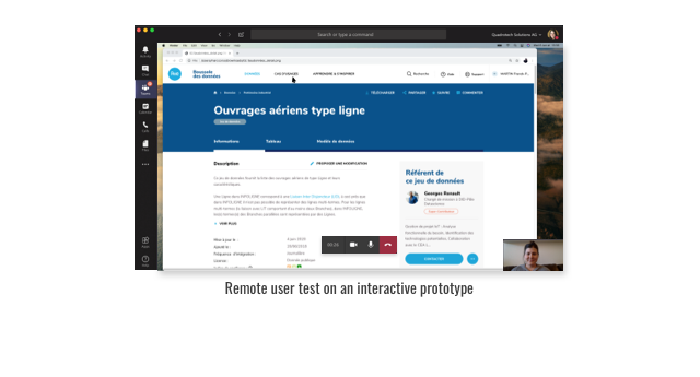 User test
This whole process then led to remote user tests for validation.
I carried out the five tests by sharing a list of scenarios with the different users. While each user was looking at his screen, the RTE internal teams also observed the same screens from a different location.
Not only did we spot areas where improvements could be implemented relating to wording, accessibility and design, but we all also agreed on what worked and what needed to be changed. This was in contrast to the situation a few weeks previously, when problematic areas had been difficult to identify, thereby confusing the decision-making process and making it more difficult to master.
With a renewed sense of accomplishment we updated the prototype and RTE went forward with confidence.
The internal team considered the ‘Data Compass’ project to be a great success: with members discovering new working methods that were taken on board and integrated into a new working system. Using rapide prototyping, remote co-design and user centered methods.
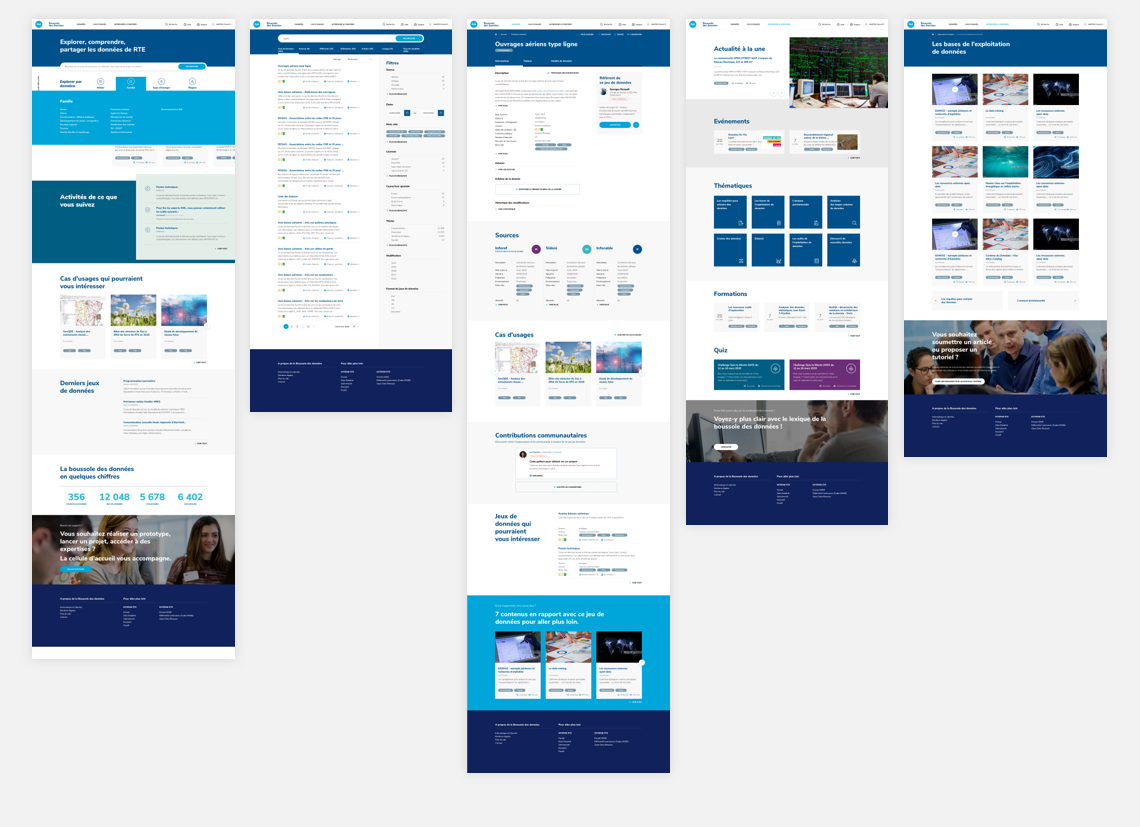
RTE was delivered with ready-to-integrate designed interfaces, together with a clear understanding of the specifications underpinning each user journey.